Unit 1
WEEK 1
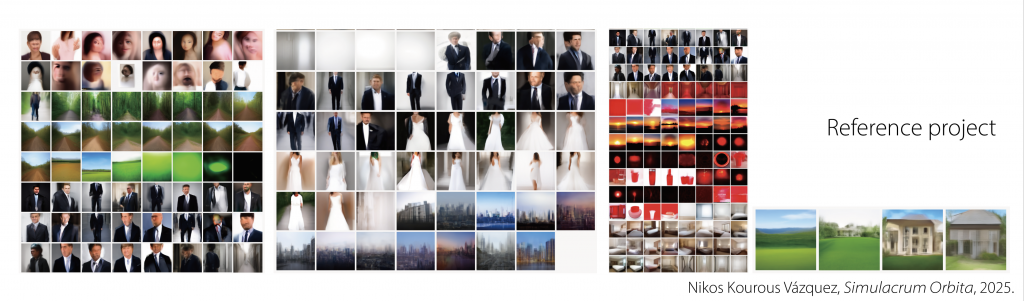
https://nikos.kourous.net/Simulacrum-Orbita
I chose this project because I had never really used AI image generation in my own creative work before. I wanted to try it out and see what I could do with it.
When I was looking for a project to recreate, I found Simulacrum Orbita by Nikos Kourous Vázquez. I thought his way of using AI was quite interesting, because instead of just generating one image, he keeps repeating the same process.
Basically, an image is described by AI, and then that description is used to generate a new image. The new image is described again, and the process continues. So, each new image comes from the previous one, rather than directly from the original image.
I thought this would be a good way for me to explore AI image generation, so I decided to try a similar process myself.
For my own experiments, I chose four photographs that I had taken myself. They are a seascape, a selfie, a plate of seafood, and an interior space at my school.
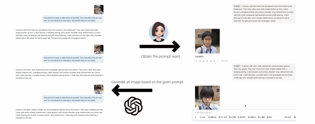
I used two different AI tools for this process: ChatGPT and Doubao, which is an AI tool from China.
First, I uploaded each photograph to ChatGPT and asked it to describe the image in words. I then used the description it provided as a prompt and gave it to Doubao, which generated a new image based on that text.
After that, I uploaded the new image to ChatGPT again, got a new description, and used it to generate the next image in Doubao. I repeated this process ten times for each photograph.
So, the image generation and description were done using two different AI tools, with ChatGPT describing the images and Doubao generating them. I wanted to see how the images would change through this process.

The first experiment is a photograph I took by the sea.
At the beginning, the sky takes up quite a large part of the image, with the cliffs and the sea below it.
As the images are generated, the general subject stays quite similar. We can still recognise the cliffs, the sea, and the coastline. But the composition changes quite a lot.
In some of the later images, the cliffs and the sea become more dominant, and some images start to look more like travel photography or promotional images.
I found it interesting that the images still look like seascapes, even though they become quite different from my original photograph.

The second experiment is a selfie of myself.
This one was quite surprising to me, because the first generated image already looked very different from the original. The person in the image appeared to be a girl, and the facial features also changed quite a lot.
In the later images, some details, like the glasses and the striped shirt, were still there. But the face, hairstyle, and overall appearance kept changing.
Compared with the seascape, I felt that the changes here were much more noticeable, because the image was supposed to represent me.
It made me wonder how much of a person’s appearance can actually remain when the image goes through this process again and again.

The third experiment is a photograph of a seafood platter I had eaten a few days before.
In this sequence, many of the original food items are still recognisable, such as the prawns, mussels, scallops, and lemon.
However, their positions, quantities, and arrangements keep changing. The original photograph shows the food together with the table and its surroundings, but some of the later images look more like carefully arranged food photography.
Some images even include text, which makes them look a little like restaurant menus or promotional images.
I found it interesting that the images were not simply losing details. They were also being rearranged into differeyunt kinds of images.

The last experiment is a photograph of an interior space at my school.
In this sequence, some architectural features appear repeatedly, such as the curved roof, the stairs, and the railings.
However, the way these elements are arranged changes. The viewpoint also changes, and the positions and numbers of people are different in some images.
So, although the generated images still look like similar architectural spaces, they do not necessarily represent the same space as my original photograph.
I found this interesting because some features remain recognisable, even when the overall structure and layout change.
Written response – Draft 1
I started this project by copying Simulacrum Orbita (2025) by Nikos Antonio Kourous Vázquez. In this work, AI repeatedly describes and regenerates images, creating a feedback loop in which each new image becomes the starting point for the next one.
I was interested in how an image might change through this process, so I tried a similar method using four photographs I had taken myself. I used one AI tool to describe each image and another to generate a new image from the description. I repeated this process ten times for each photograph.
I expected the images to become less recognisable after several rounds. However, many of them still looked surprisingly similar to the originals. Some details changed, but the subjects and overall compositions often remained.
This made me question what repetition actually changes. Why do some parts of an image disappear while others stay? Does repeating the same process always create something new?
For my next experiment, I want to layer the different generations together at low opacity. By placing them in the same image, I hope to see which shapes and compositions keep appearing and which ones gradually disappear.
Reference
Kourous Vázquez, N. (2025) Simulacrum Orbita. Available at: https://nikos.kourous.net/Simulacrum-Orbita (Accessed: 23 October 2026).
WEEK 2
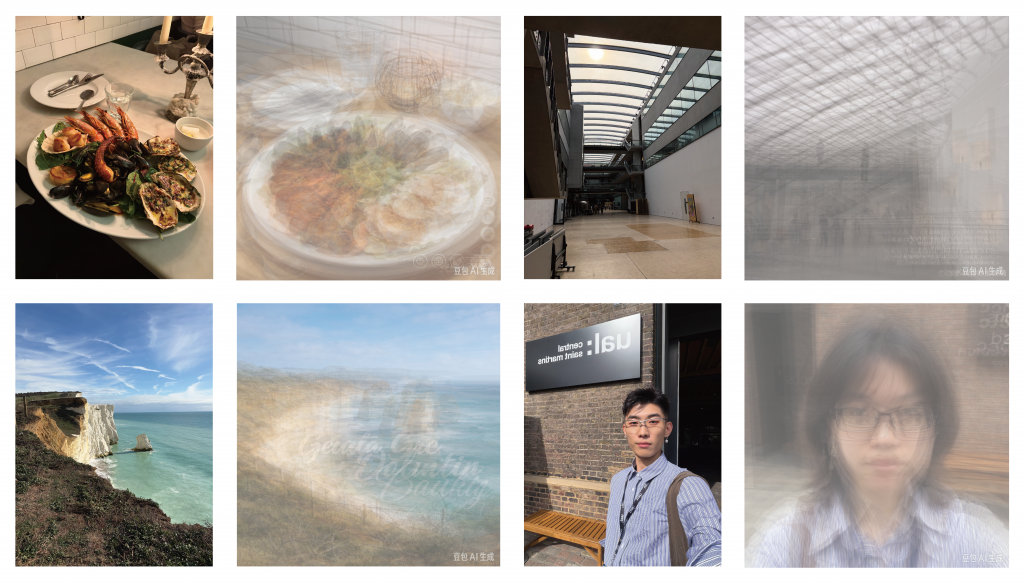
For the first part, I layered the ten images from each group, with each image at 15% opacity.
I found that, even though the images were different, the overall shapes were still quite similar when they were layered together.
When I looked at them separately, the differences felt more obvious. But when I put them together, I could see some shapes and structures appearing across the images.
I wanted to see if there was something that stayed relatively similar, even after the images went through several rounds of AI generation.

Then I focused on the landscape images.
I took the ten AI-generated images from my last experiment and simplified each one into large colour blocks. I removed the smaller details so I could focus more on the main shapes and how the sky, cliffs, and sea were arranged.
After that, I layered these ten colour-block images together, again using 15% opacity.
I wanted to see what would happen when I looked at the images in this simpler way. With the details removed, I could focus more on the overall shapes and see how similar or different they were.
This was also different from my last experiment, because I was no longer just letting AI change the images. I was deciding how to simplify them myself.
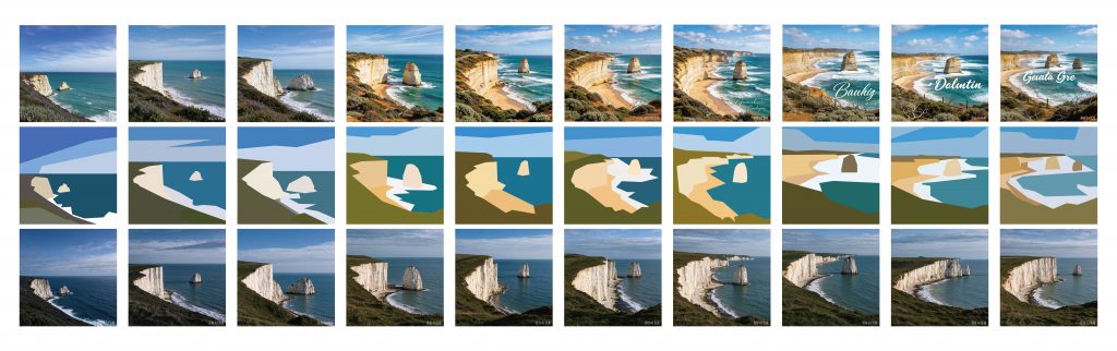
For the third part, I gave these colour-block images back to AI and asked it to generate realistic photographs based on what it understood from them. I generated ten images again.
I found that the new images were quite close to my colour-block images in terms of their overall shapes and layout. But they didn’t really keep the colour tones that I had used. The colours in the photographs were quite different from the colours in my colour-block images.
I also noticed some interesting changes in how AI interpreted different areas. For example, an area that I saw as grass could become land, or an area of land could turn into a mountain. Because AI was only working from these simplified shapes, it seemed to have more freedom to decide what each area actually was.
So, the general layout was still there, but the meaning of some shapes changed. AI could keep the overall structure while interpreting the actual scene quite differently.
Written response – Draft 1
I began this project by copying Simulacrum Orbita (2025) by Nikos Antonio Kourous Vázquez. The work uses a repeated cycle of AI image description and generation, where the output of one round becomes the input for the next. I wanted to explore this process using my own photographs.
I selected four photographs and repeated the description and generation process ten times for each one. I expected the images to gradually move away from their original appearance. However, I noticed that many of them remained recognisable. Details changed, but the main subjects and compositions often stayed similar.
This made me interested in a different question. Instead of only looking at what changes, what happens if I focus on what remains?
In my second stage, I placed ten generations of the same photograph on top of each other, using 15% opacity for each layer. The result looked like a collection of overlapping memories. Some areas became blurred because their positions changed, while other shapes became more visible because they appeared repeatedly.
I liked how the layering made it possible to see patterns that were difficult to notice in individual images. However, it did not fully explain why those patterns remained. It was a way of making repetition visible, rather than an answer to what caused it.
I also experimented with simplifying AI-generated landscape images into large blocks of colour. I removed small details and kept the main shapes and colour areas. I layered the simplified images together and then used individual simplified images as inputs for further AI generation.
This made me think about how much visual information is needed for an image to remain recognisable. Even when details were removed, certain colours and compositions could still suggest a landscape.
During this stage, I read the Conditional Design Manifesto by Luna Maurer, Edo Paulus, Jonathan Puckey and Roel Wouters. The authors focus on the process rather than only the final product, and describe how rules and inputs shape what happens (Maurer et al., 2008).
This helped me look at my experiments differently. I had been repeating a fixed process, but I was mostly judging the final images. The reading made me realise that the rules themselves were also part of the design.
At the same time, I could not fully control what AI generated. I chose the photographs and decided how to simplify or layer them, but the results still included unexpected changes.
I now want to pay closer attention to how my decisions shape the process, rather than only asking whether the final image looks different. Repetition has become a way for me to investigate which visual patterns survive and how they become visible.
References
Kourous Vázquez, N. (2025) Simulacrum Orbita. Available at: https://nikos.kourous.net/Simulacrum-Orbita (Accessed: 23 October 2026).
Maurer, L., Paulus, E., Puckey, J. and Wouters, R. (2008) Conditional Design Manifesto. Available at: https://www.conditionaldesign.org/manifesto/ (Accessed: 30 October 2026).
WEEK 3
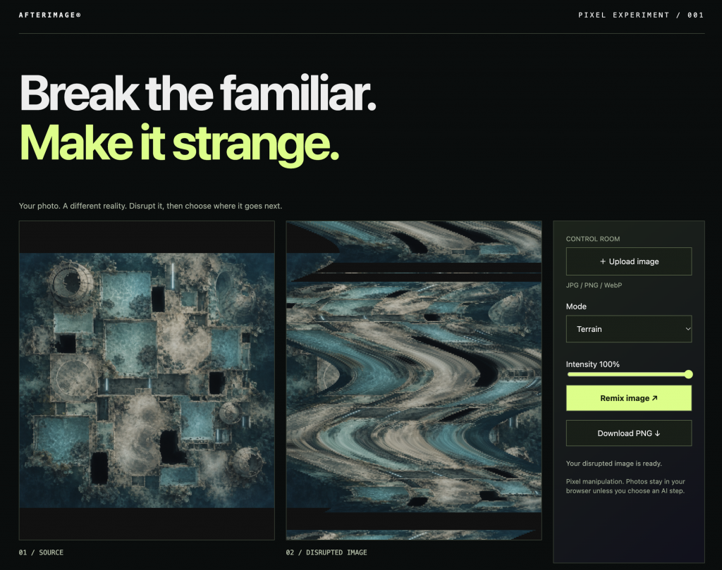
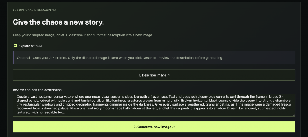
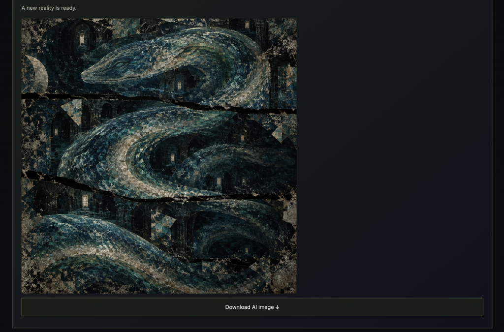
https://afterimage-lab-291029.magicjay47.chatgpt.site
After reading the Conditional Design Manifesto, I started thinking more about how changing the rules of a process could lead to different results.
So, with the help of AI, I made this website called Afterimage.
You can upload an image here, and there are three different modes: Fracture, Terrain and Mirror. You can also change the intensity from 0 to 100 percent, or click Remix to get a different result.
Let me quickly show you how it works.
After I break the image, I can ask AI to describe it. Then I use that description to generate a new image.
So basically, I wanted to see what AI would make from an image that had already been broken.
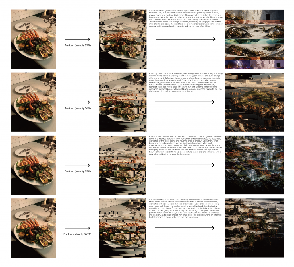
For the first experiment, I chose three photos I took myself and tested them with different modes. For each photo, I tried four intensity levels: 25, 50, 75 and 100 percent.
This first one is a photo of food, and I used Fracture.
As you can see, the image gets cut into horizontal pieces.
What I found quite funny was that AI didn’t see food anymore. It started describing things like buildings, landscapes and ruins, and the new images looked like strange cities.
But if you look at the results, you can still see those horizontal layers from the broken image.
So even though the food disappeared, some of its shapes were still there in a different form.
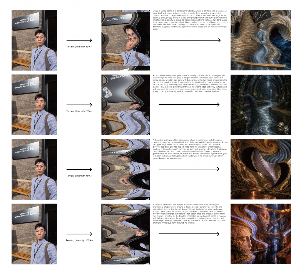
The second one is my selfie, and I used Terrain.
This mode makes the image look stretched and wavy.
At 25 percent, AI still generated a person, but the background already looked quite different.
Then, at higher intensities, the person started to disappear. Instead, AI generated tunnels, brick walls and underground spaces.
I thought this was really interesting because the original photo had a brick wall behind me. After the image was distorted, AI seemed to turn those bricks and curved shapes into a whole new space.
So the result was completely different from a selfie.
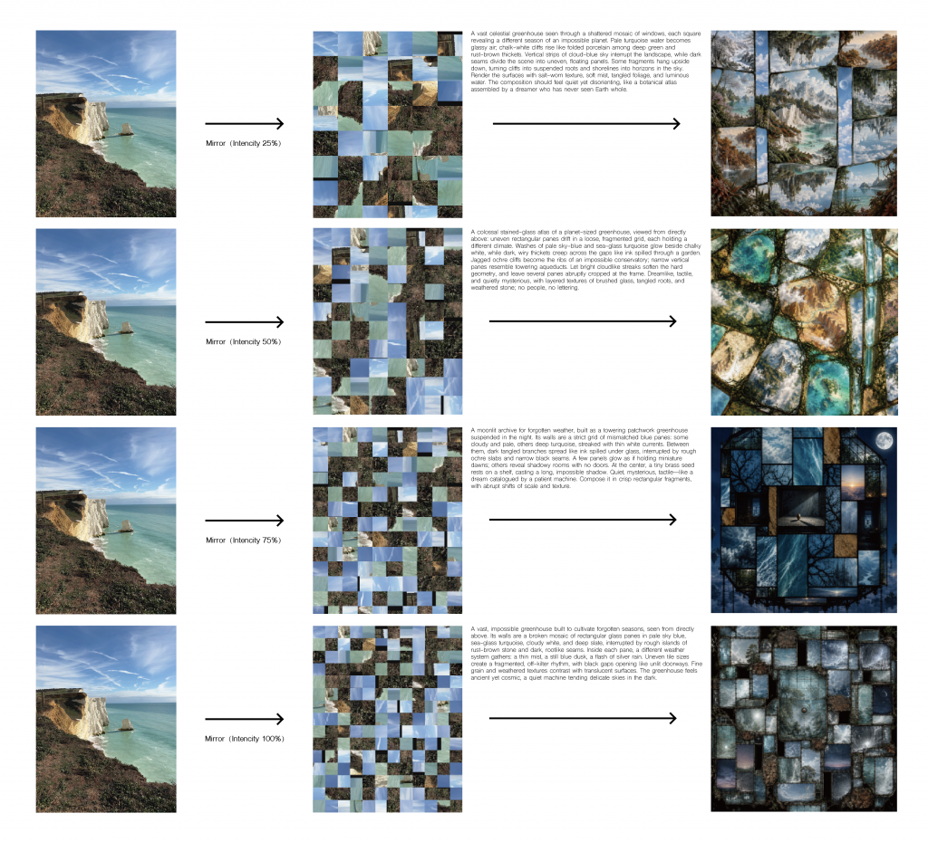
The third one is a landscape photo, and I used Mirror.
This mode breaks the image into lots of small rectangular pieces.
What surprised me was that AI started turning the landscape into things like greenhouses, glass windows and buildings.
At lower intensities, you can still see some natural elements, like the sky and water. But at higher intensities, the results look more like architecture.
And in almost every image, you can still see the grid pattern.
So for these three experiments, I noticed that different ways of breaking an image could lead to very different results.
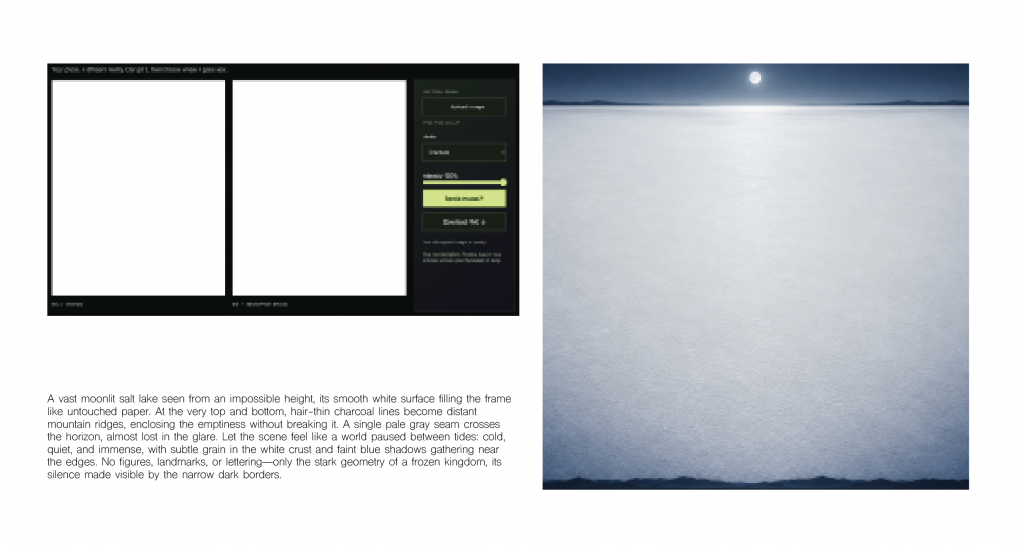
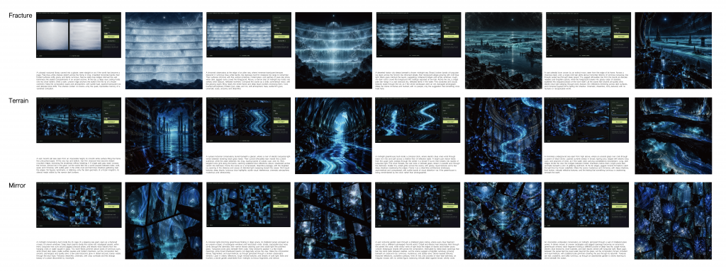
Then I wanted to try something a bit different.
I was thinking, if I really want to see what AI will create, maybe I should start with an image that gives it almost no clues.
So I chose a completely white image.
There’s no person, no object and no clear scene. I thought this would be a good way to start with as little information as possible.
And the first thing AI generated was actually a snowy landscape, which I found quite interesting.
After that, I took each generated image and put it back into the website for the next round. I repeated this twelve times, using the three modes and four different intensity levels.
As you can see, the image slowly changed from snow into blue cities, tunnels and some really strange spaces.
I also noticed that even though the images kept changing, some colours and shapes appeared again and again.
I didn’t expect the process to go in this direction, especially because it all started from a white image.
Written response – Draft 3
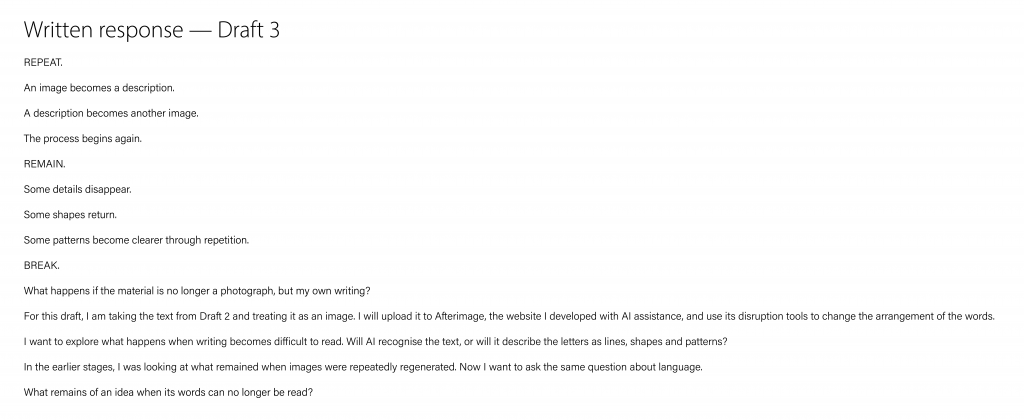
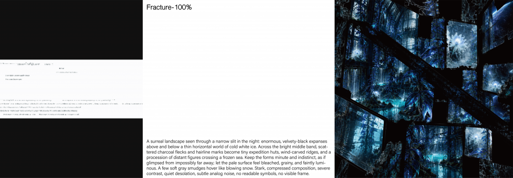
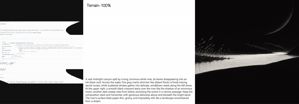
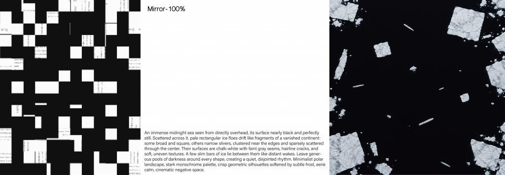
For Draft 3, I used my own writing as the starting image. I placed the text on a white page and uploaded it to Afterimage. I tested Fracture, Terrain and Mirror, all at 100% intensity.
Each mode broke the text differently. AI then described the disrupted images and generated new ones from those descriptions.
The results became a snowy landscape, a dark river and floating ice.
The original words were no longer readable, but their broken shapes influenced the new images.
So that’s what I’ve been experimenting with.
I started by trying to make AI-generated images change more, but in the end, I became more interested in how AI turns broken shapes into completely different things.
And I think the most interesting part is that even when the original image is no longer recognisable, something from it can still remain in the new image.